CASE STUDY
Improving the
search function
search function
30-second summary
- Role
- UX/UI Design & Research
- Year / duration
- 2022/23, 4 months
- Scope
- HiDrive search across desktop, mobile, and tablet platforms
- Methods
- Competitive analysis, user interviews, usability testing, prototyping, stakeholder alignment
- Outcome
- Responsive advanced-filter concepts, cleaner result layouts, and implementation-ready UI
- Proof
- +72.6% search-bar interaction lift, 5 usability sessions, and 5+ hours of recordings
HiDrive is a cloud storage service, similar to Dropbox or Google Drive, and is based in Germany. As part of Strato, it serves both business and personal customers across six countries.
As a UX/UI designer for HiDrive, my role was to enhance the product's usability and aesthetics, ensuring alignment between business objectives and user needs.
As a UX/UI designer for HiDrive, my role was to enhance the product's usability and aesthetics, ensuring alignment between business objectives and user needs.
Problem
Users were not engaging with HiDrive's search functionality.

How to integrate advanced search filters into HiDrive without overwhelming users or violating technical constraints?
Solution
We redesigned the search interface with always-visible dropdown filters and a cleaner results layout, making search intuitive on desktop and mobile.
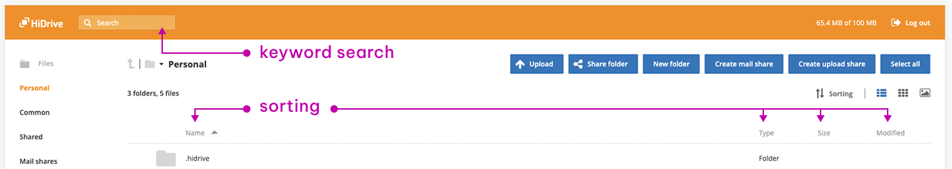
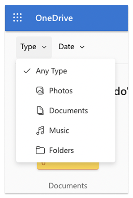
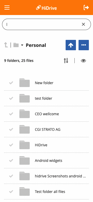
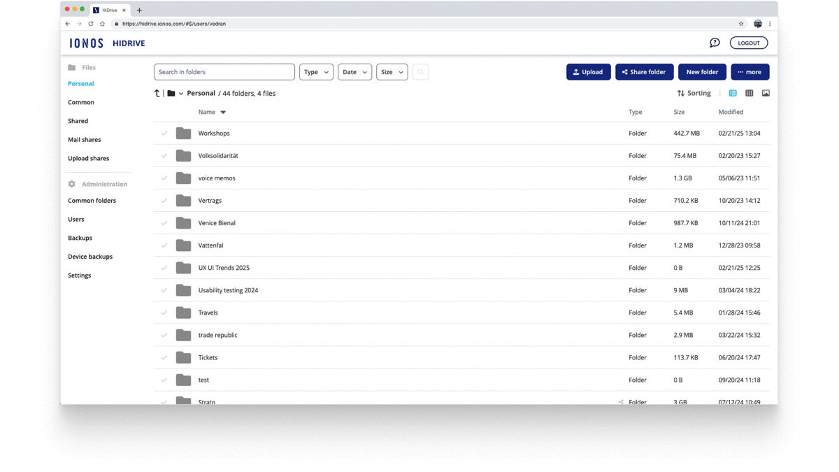
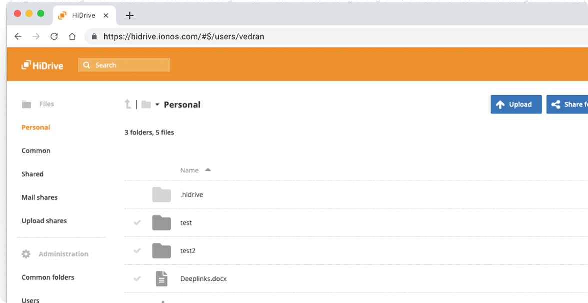
Before
Keywords search only
Keywords search only
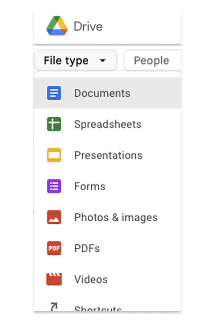
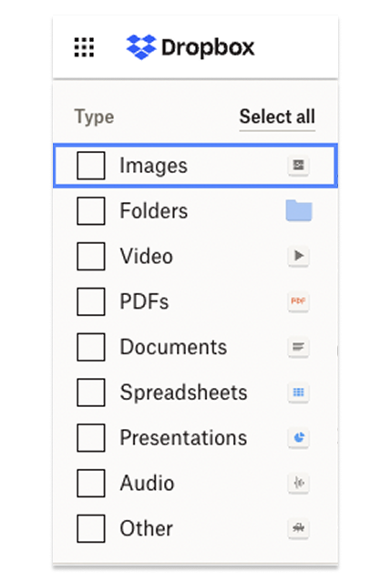
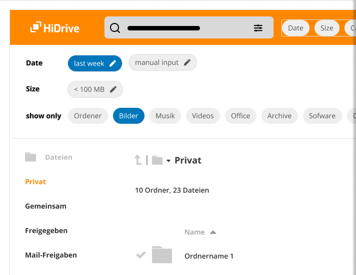
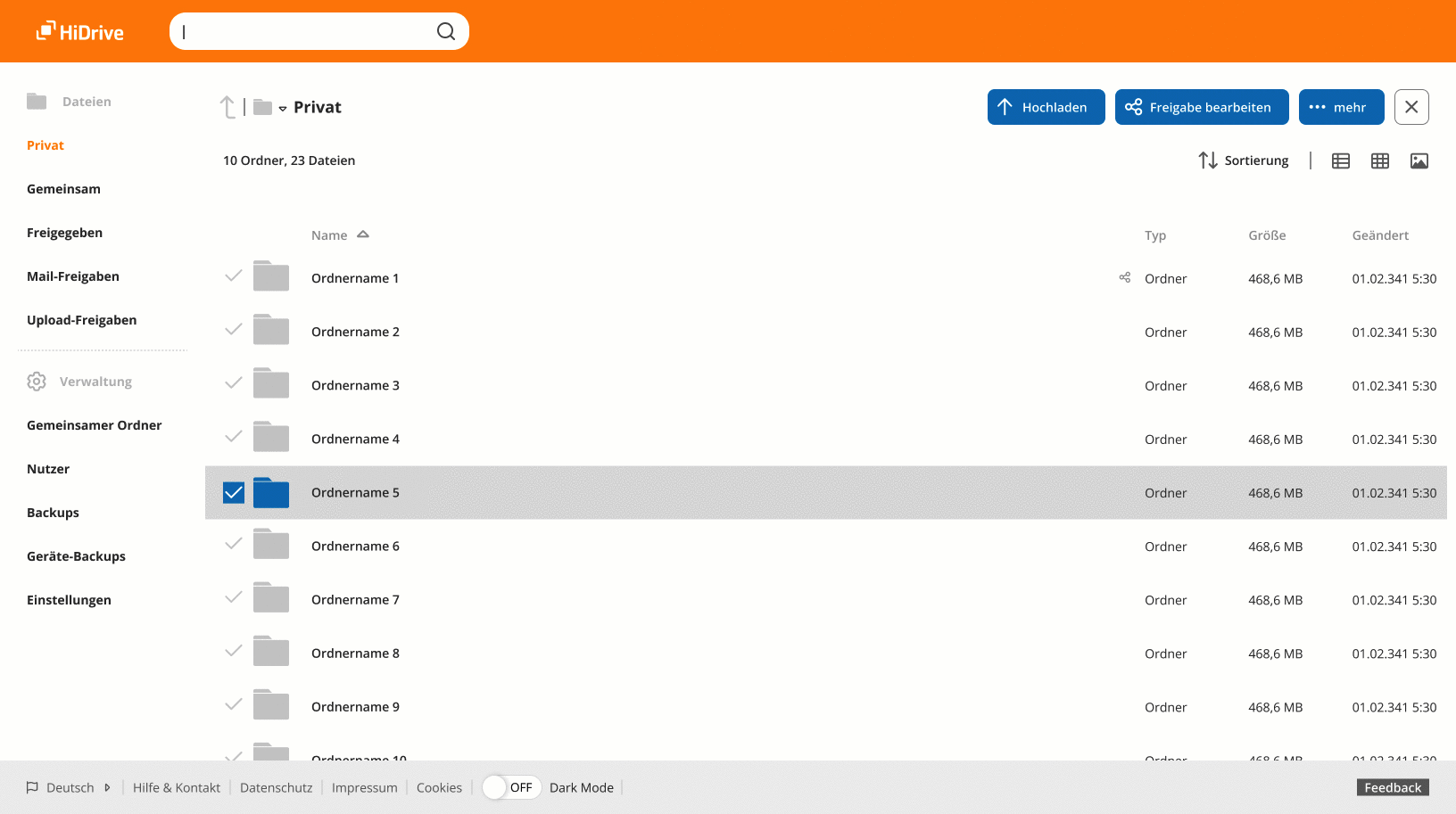
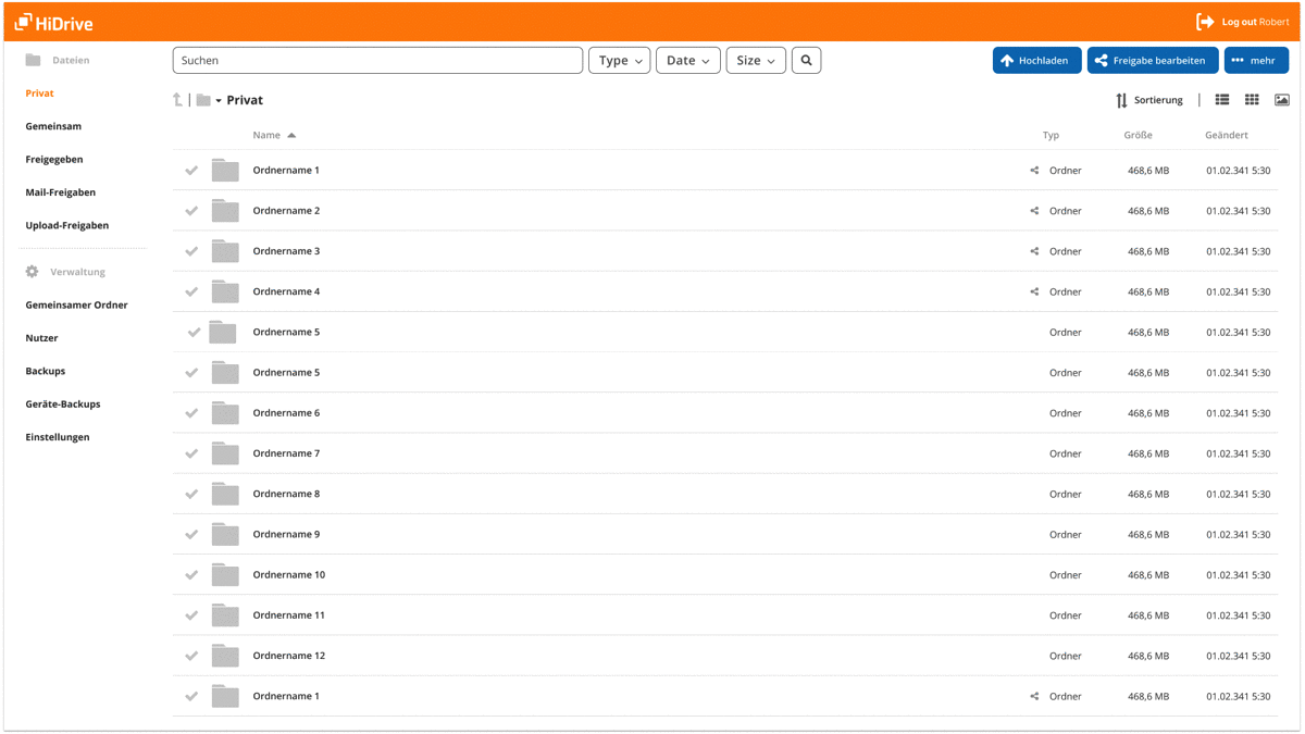
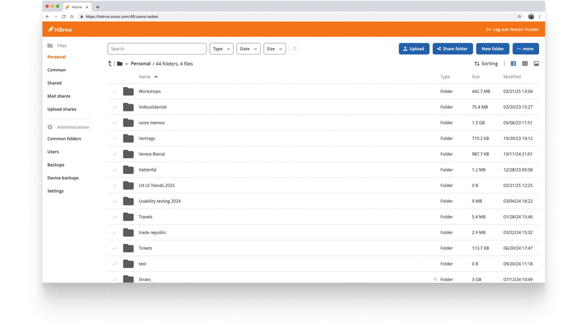
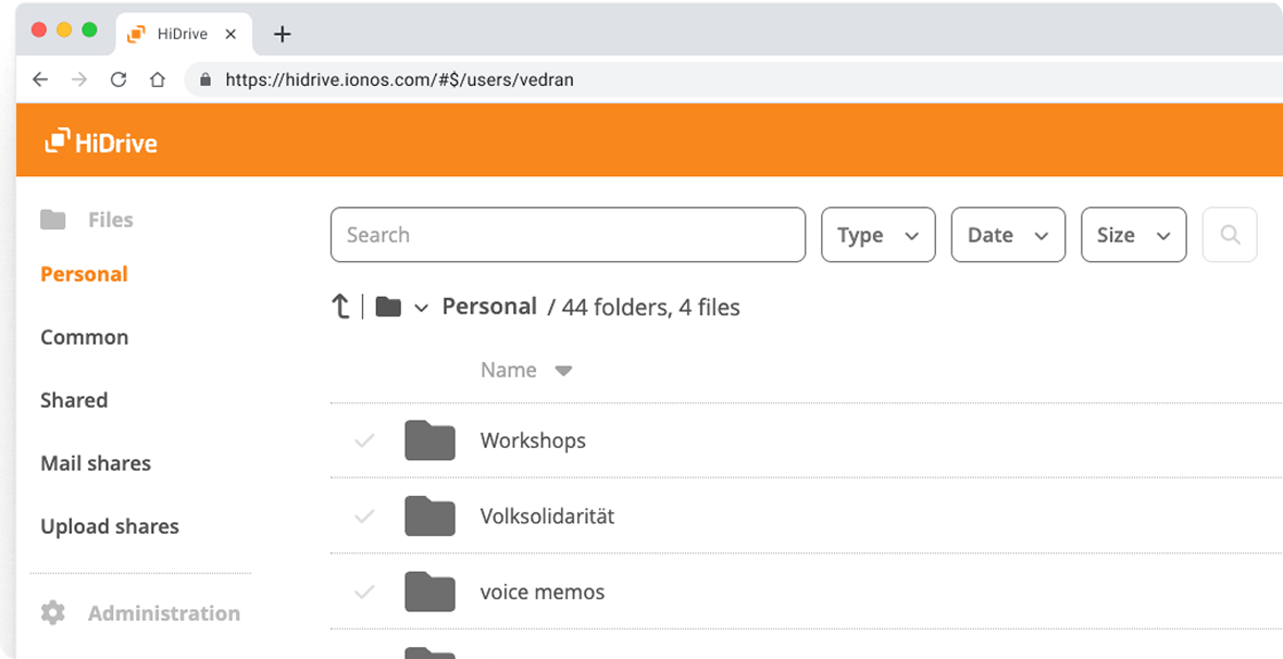
After
Advanced filter search
Advanced filter search
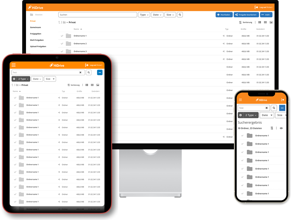
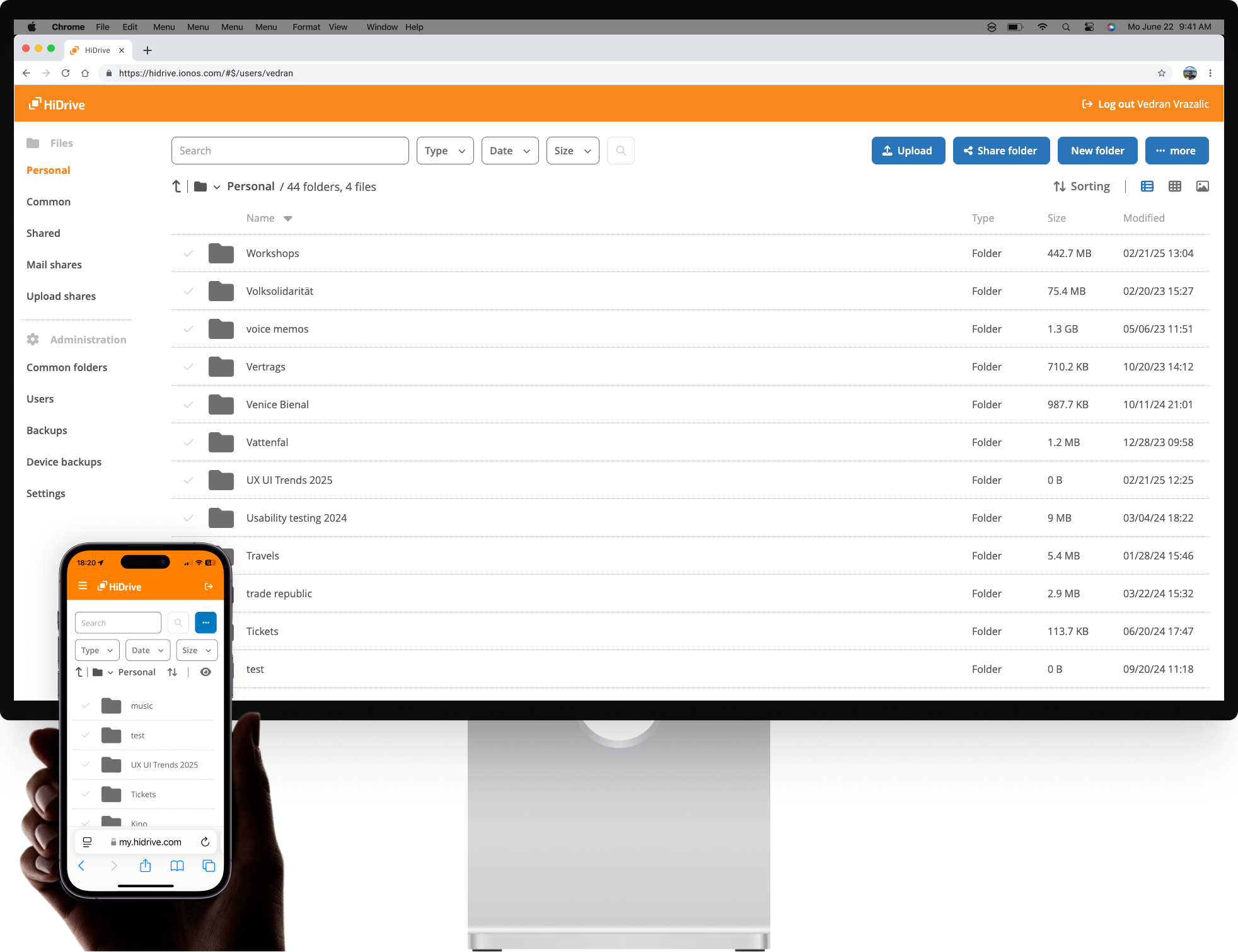
Below, you can see an advanced filter search with breaking points for desktop and mobile.
Impact
Knowing that most HiDrive users browse on desktop, I optimized for larger breakpoints. Based on internal analytics after rollout, search-bar interaction rose from a low baseline to a +72.6% lift. I influenced the interaction model, tested prototypes, and implementation-ready UI; analytics instrumentation and backend search behavior were outside my ownership.

Curious how this result came to life?
Let’s walk through the process — it takes 8 minutes to read.
Let’s walk through the process — it takes 8 minutes to read.
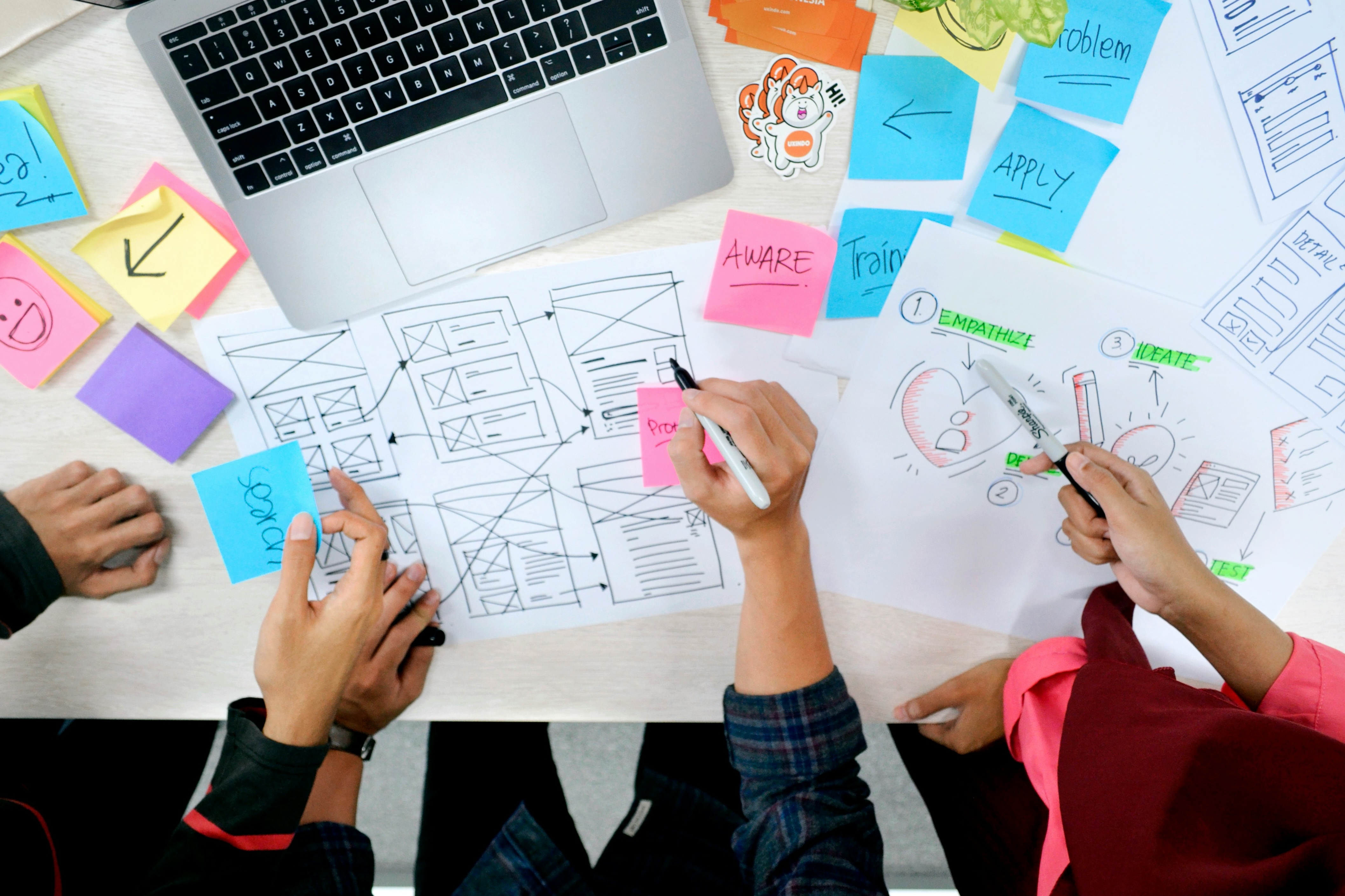
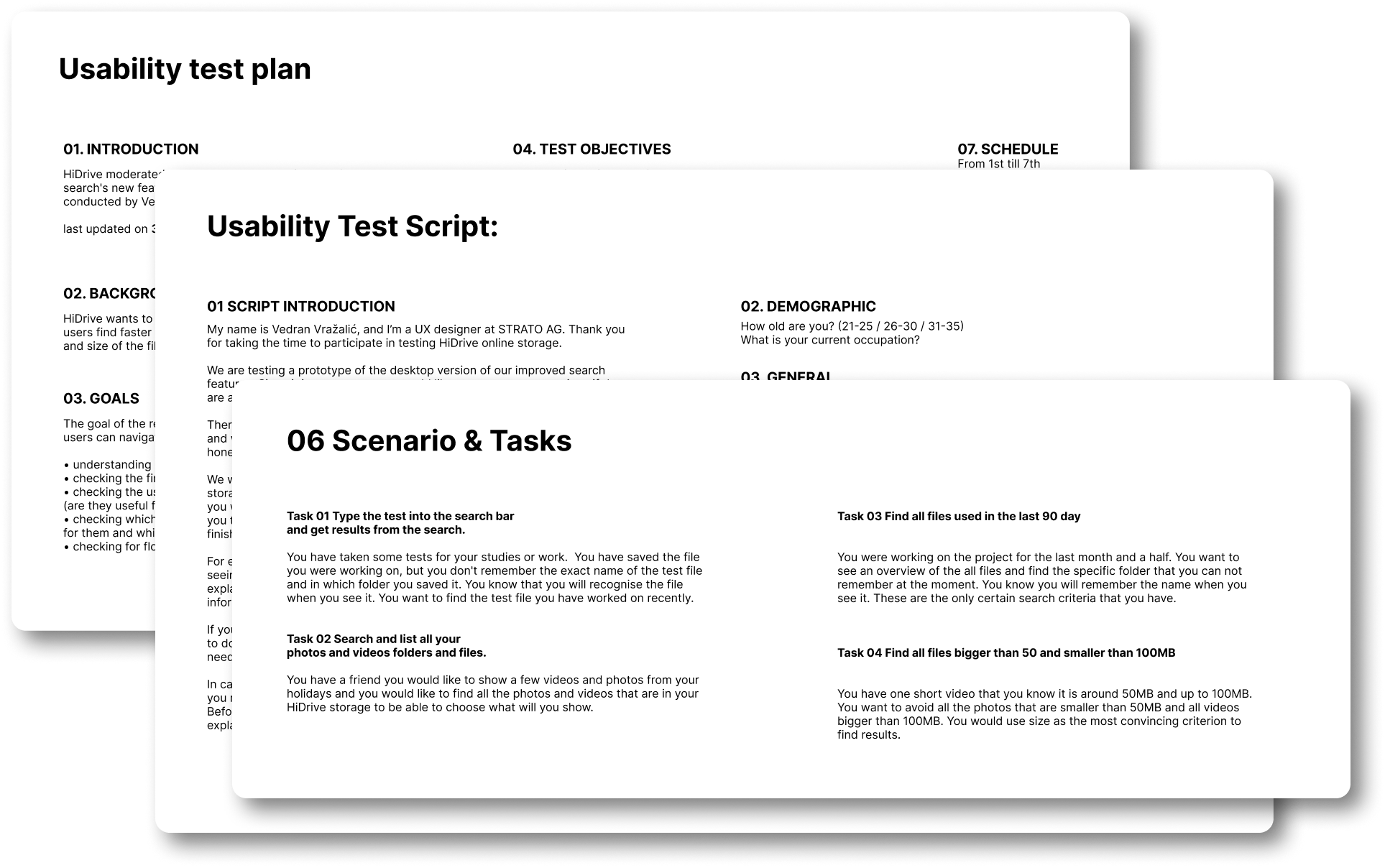
Process
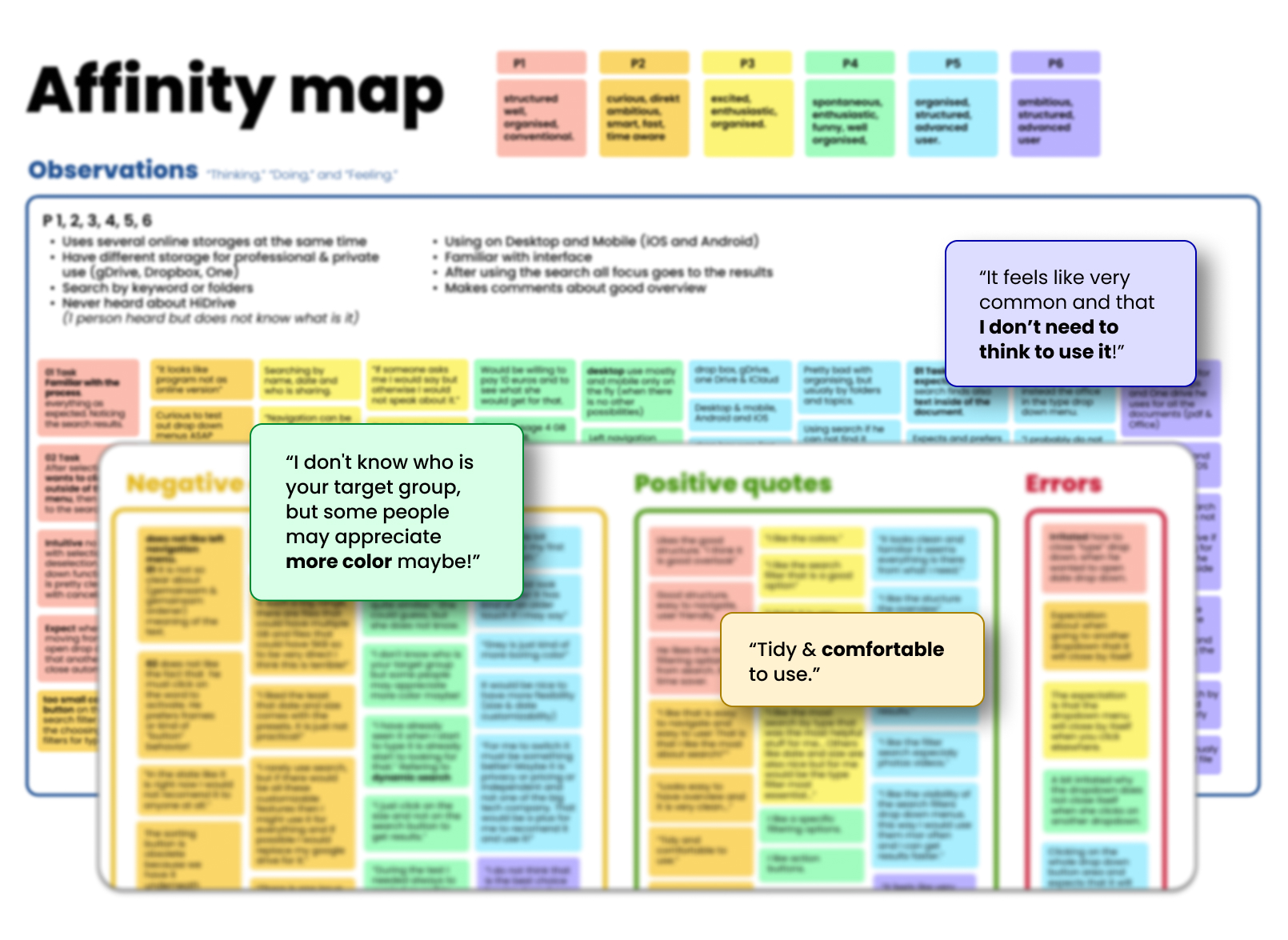
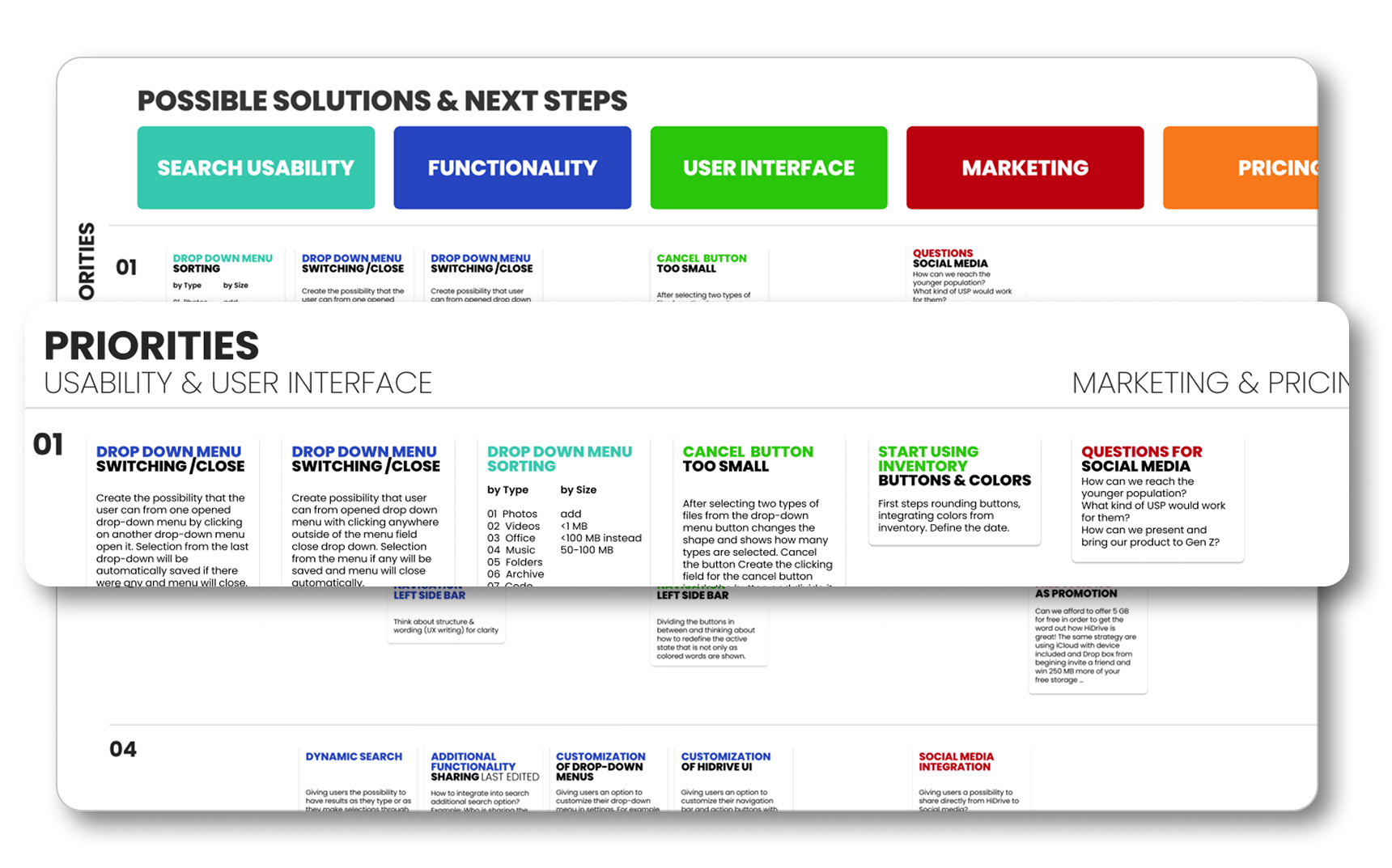
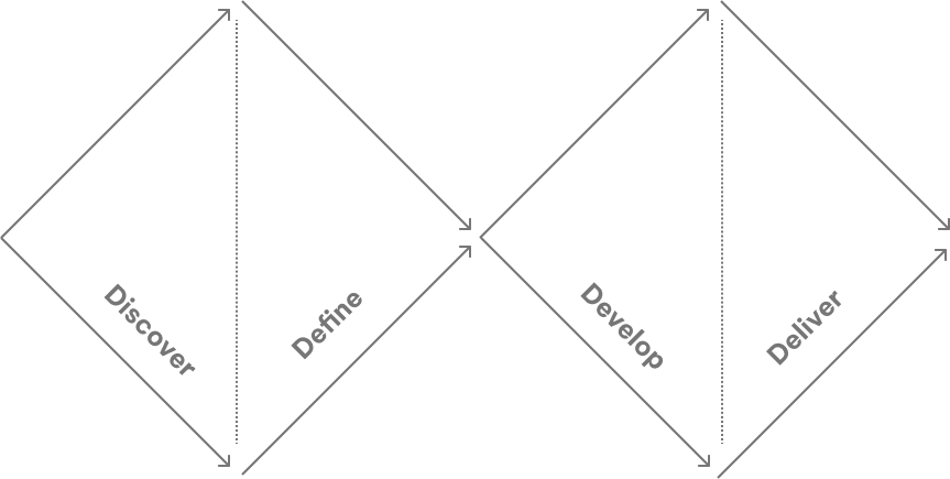
During several months I used a Double Diamond innovation and design process, including User-Centered design and Design Thinking.
Double Diamond
Use the interactive menu below to jump between steps,
and click Process in the left sidebar to come back.